Inside The Process - New York Times Book Review
A look into the choices, compromises and epiphanies that go into making an illustration.
This is an Inside The Process letter of The (Im)posture — the newsletter from Julien Posture. If you enjoy it and want more like it in your inbox, consider subscribing.
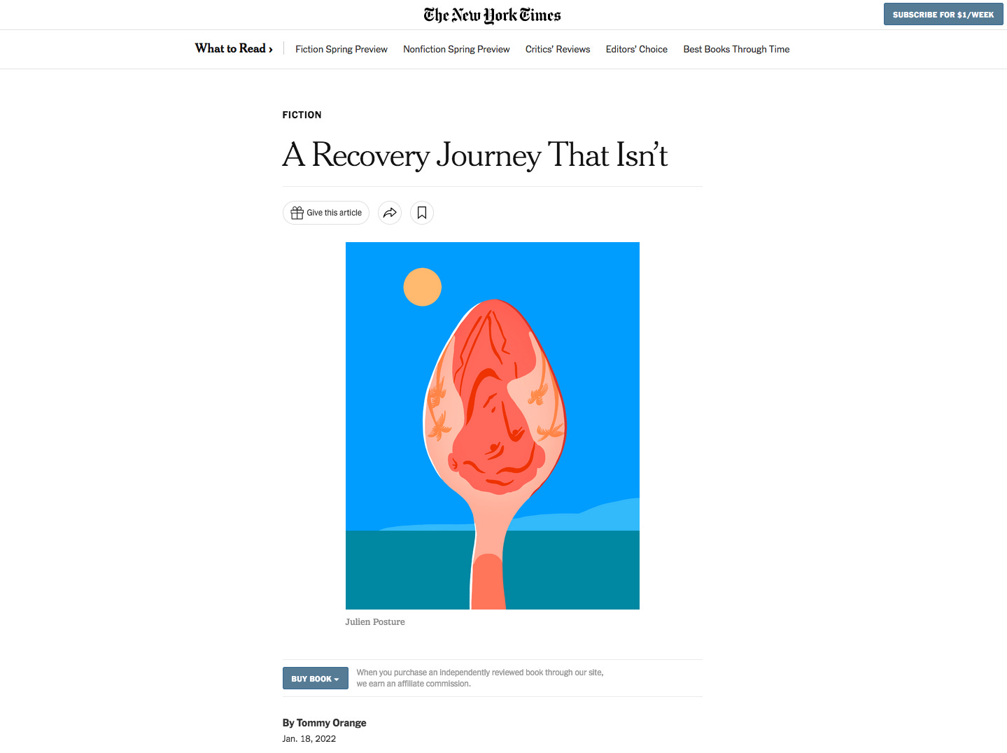
A Recovery Journey That Isn’t - New York Times Book Review - AD : Deanna Donnegan.
Earlier this year I made this image for the review of the novel All Day Is A Long Time, by David Sanchez for the NYT Book Review. I was excited because I got contacted by Deanna Donegan, with whom I had loved working a few years ago on the parenting section. I was also excited because the topic of the book was a promising challenge. This drug addiction story is set in sunny Florida, and I immediately knew I wanted to visually use this discrepancy between a very dark topic and a very bright landscape.

I used to be way more methodical about my way of drawing juice from a text at the beginning of my career. I used to use mind mapping and other ways to systematically come up with concepts. I don’t do this anymore. As you can see on the first page of sketches, I summed up some key words relevant to the story as well as some characters in the book. Nowadays, I tend to get away from the original text pretty quickly by rephrasing what I think is important in my own words and I use this as a point of departure. I do that for two reasons.
The first one is that this helps me take up more “authorial” space in the illustration process. I used to feel stuck in someone else’s words sometimes and I don’t when I do the work of reformulating things for myself. For example with this image I had summed up the book as something like “a feeling of alienation caused by the addiction and reinforced by the ridiculously sunny place, portrayed as a repetitive, warped narrative”.
The second reason is that when I rephrase a text in my own terms, I use a lot more visual cues than a journalist might have, because, well, illustration is visual. So here I focused on how this feeling of repetition, of warped narrative - which refers to the way the book is written more than what it is about - could inform the formal aspects of the image itself. This really helps me making images that are not just about what I draw but also how I draw it.

You see in the sketches I tried a lot of repetitive compositions, I’ve also google street view the town the book is set in and found those white fences being really striking as well. It was important for me to keep a reference to the sunny beach while playing with the form of the image to talk about addiction.
Above are the four sketches I ended sending to Deanna. I often write a little sentence to clarify what I want to do with the final image. I don’t know if that’s a good idea but I know the art directors have to talk to the editors about the illustrations and I figured these people might struggle a bit with just doodles. That’s just my feeling, I’d love to know whether that makes sense or not.
Lucky for me, we went for my favourite, the spoon one. I never thought it would fly cause it’s such a direct reference to drugs but I’m happy it worked out. Apparently the editor said that this option “perfectly captures the slightly surreal vibe of the book, the inability to avoid distortion!". So yay !
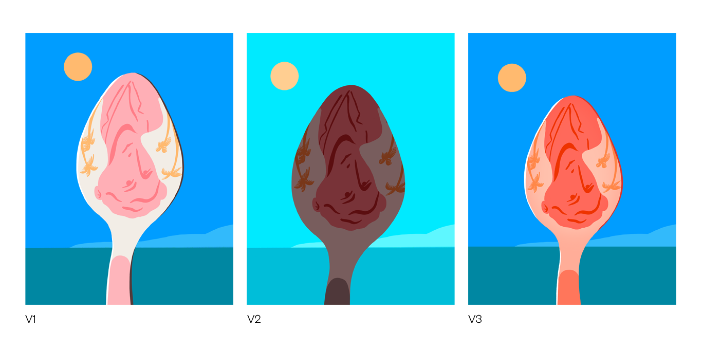
The path to the final is often a sinuous one, with lots of little tweaks. V1 looked too much like a delicate porcelain spoon, V2 was too dark, so we set on V3, which at first thought looked like an ice cream spoon but I ended up warming up to it. I’m really happy with how this one turned out, I love that from a distance, or a quick look, it looks like a typical surf story but from closer, we see this distorted portrait in a heated heroine spoon, which is exactly where I wanted to go.
And here is the final image. I hope this little insider’s view into the process of making an editorial illustration was useful. I love the way an image evolves through collaborative effort and I don’t think the image would have turned out as well without the art director’s input.
Let me know in the comments what your process is like, and if you’d like to see more insights into my professional or personal work process !
If you enjoy receiving this newsletter in your inbox, please consider going to the paid version. The paid version is exactly the same as the free one. This is because I believe paying for someone’s creative work shouldn’t be about paywalling readers but about “payspringboarding” writers. If you agree and can afford it, you can switch to the paying version here.
You can also follow me on Twitter or Instagram. This letter is the start of a conversation, don’t hesitate to share it, like it or comment below !


So grateful that you shared your process. I operate in a very similar manor, but I love that fact that you rephrase the original text in order to aid your illustration process. This is something I struggle with. I feel obligated to stick to the text religiously at times and it often comes at the expense of my visual range.
I'm curious, how do you navigate tone/mood in your process as you reimagine the text into image? With this work you mentioned the dichotomy between the setting and subject being your main focus, making your final product eerie and foreboding in a paradise. Was this a gut instinct? Or are you making illustrations in a range of feeling and then reexamining it in relation to the text? I guess what I'm asking is how do you know (or trust) that your tone/mood taken towards the text is right?